A font of investment

Exame is one of the most reliable sources of information for Brazilian audience when discussing economy and finances. And we way past the trend of having to be cold and “sans-serify” when talking about money. Exame’s rebrand was developed by GUT São Paulo, and makes the brand memorable, colorful and expressive. Just the way we like it.
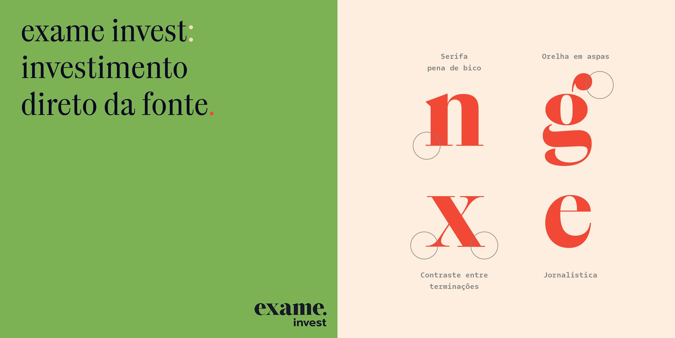
We thought of it as a match made in heaven when GUT called us to design the new typeface for Exame. Initial sketches drew from Exame’s new logotype, with features such as stencil structure and round terminals.

The typeface was planned – for now – as a minimum viable product (MVP). It is a single weight font, but on the process of becoming a complete typeface. We have already mapped out two axis of variation for it: weight and optical sizes.

The art direction GUT developed for the project puts the font under the spotlight and shines when combined with the vivid photography and colors.

Alongside the refreshed brand, came their new product, Exame Invest. We were hooked by it right from its tagline: “Exame Invest, a font of investment”.

Branding
GUT São Paulo
Photography
Maltchique
Alt Retouch
Type Design
Rodrigo Saiani
Carlos Mignot